Life in 2020 is tinged by uncertainty. At a time when the world needs to pull together, often we find ourselves isolated from family, friends, and colleagues with no clear idea of when life will return to normal. In these uncertain times, there looms one welcoming oasis: home.
We’ve retreated there, hunkering down with our closest family members to ride out this madness. And, while we wait for the world to right itself, many of us have been investing in home improvement projects to make our sanctuaries even more serene.
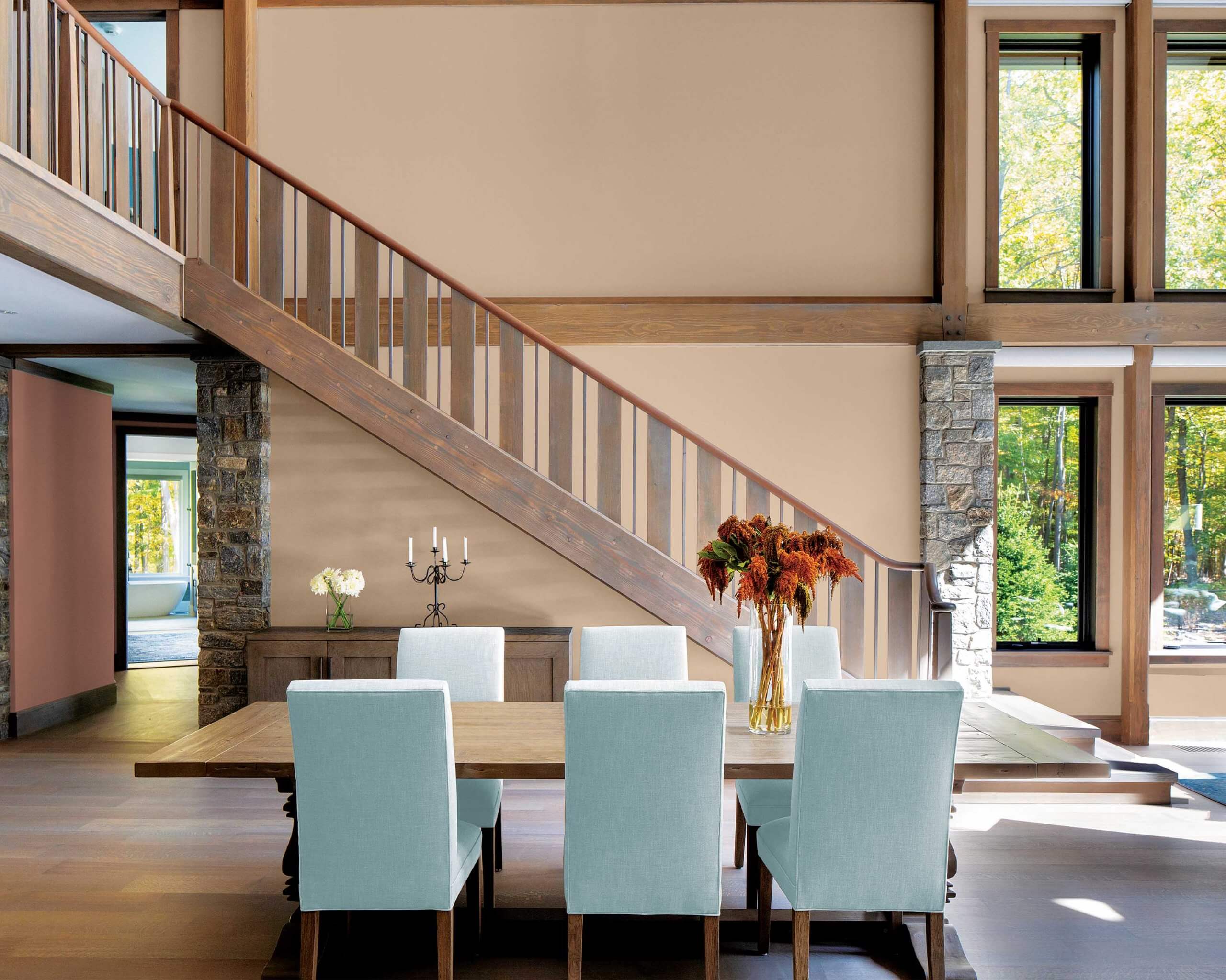
When it comes to choosing paint colours for your home, it’s interesting to learn that today’s most popular hues are driven by world events. Our desire for safety and security is translating into a colour palette driven by warmer neutrals that are replacing the cool greys of recent years.
Ashley N. Banbury is senior color designer for Color Journeys, a division of Sherwin-Williams which includes the Para Paint and General Paint brands. She is part of a marketing team that constantly monitors consumer lifestyle trends, translating those into colour forecasts for the home. She explained that a lot of research has been done to evaluate how people respond to various colours, gauging whether a certain shade makes them feel energized, calm or creative.
“So, for example, now that people are spending more time at home, they want to feel more comfortable and protected,” said Banbury. “Our homes feel like the only place we can control right now. We want to feel protected and cozy – and designers translate those feelings into colour.”
While neutrals continue to top the list of trending paint shades, warmer tones are now in demand.
“Greys are starting to warm up; you are seeing taupes, more browns with a greyness to it,” she noted. “But I’m also seeing clay tones emerging, like a red terra cotta. People are loving it because of the warmth. It feels more contemporary because we have grey tones in our homes already, but by bringing in these warm terra cotta colours, it gives a modern feel to it.”
While Color Journeys has yet to announce its 2021 colour of the year, Banbury pointed to several shades that have been big sellers so far in 2020. Among these are Council Bluff, Cotton & Flax, Fresh Farm and Wethers Field – all are soft, warm hues that promote serenity and relaxation.
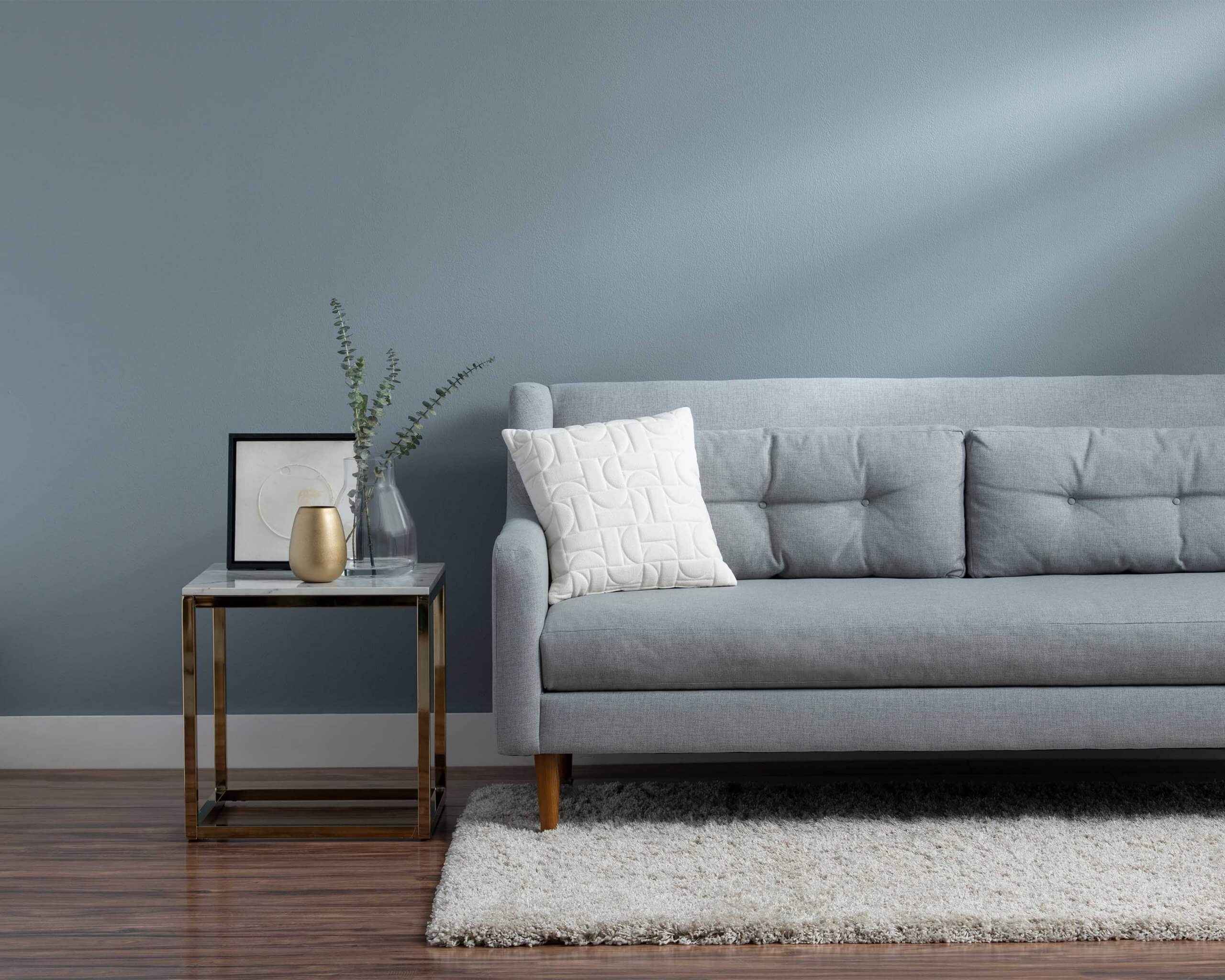 Photo courtesy of Sherwin-Williams
 Photo courtesy of PPG Paints
“Before the pandemic hit, we were already spending more time at home,” said Banbury. “With the advances of technology, we don’t need to leave our homes as much. We can order our favourite meal in, and then with social media we can connect to people. The hashtag ‘#selfcare’ became more popular as people tended to stay in, so the trends were already shifting even before the pandemic.”
PPG Paints, which represents the PPG and Sico brands, is also tuned in to consumers who are “craving simple comforts and a slowed-down lifestyle.”
PPG released its 2021 Palette of the Year, named “Be Well,” on Sept. 1, 2020. Consisting of three hues – Transcend, Big Cypress and Misty Aqua – the naturally-derived colour collection celebrates wellness in mind, body, and spirit.
“When the world experiences events that cause unrest, anxiety and grief, we tend to naturally gravitate toward compassionate colours that allow us to create a personal retreat from the world,” said Dee Schlotter, PPG senior color marketing manager, Architectural and Industrial Coatings. “These comfort colours are similar to comfort foods – both offering a certain sense of familiarity and normalcy when facing the unknown.”
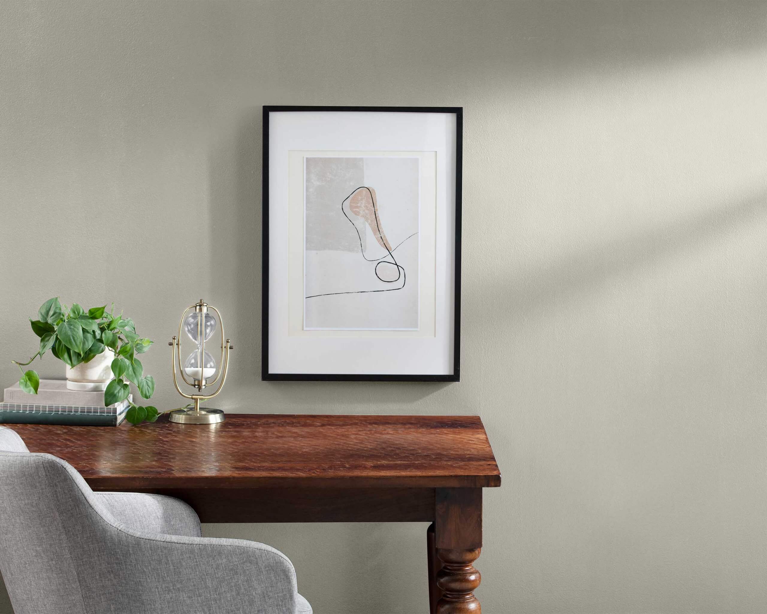 Photo courtesy of Sherwin-Williams
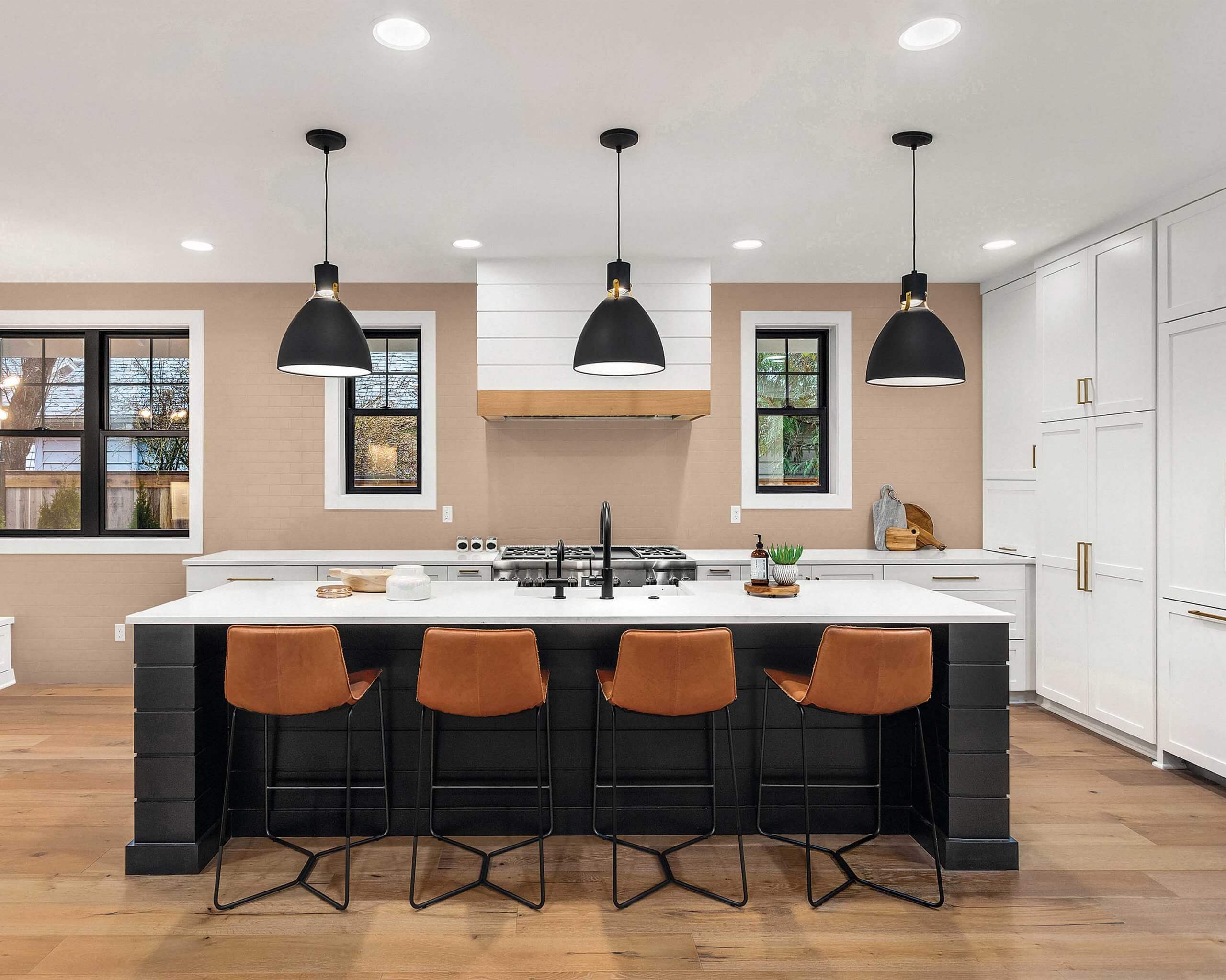 Photo courtesy of PPG Paints
The palette, along with two additional complementary collections named “Be True” and “Be Wild,” was developed by more than 30 PPG colour stylists who analyzed consumer trends, global events, and cultural inspirations to create PPG’s annual colour forecast.
Value and Performance
While consumers are increasingly investing in home renovations, there’s often a limit to the household renovation budget – particularly in these uncertain times. That’s where Laurentide Paint’s Boomerang line can fit the bill for value-conscious consumers who are also concerned about the environment.
The Boomerang line – which includes 18 shades ranging from barely-there beige to the boldest black – is manufactured from recycled paint collected from across Eastern Canada.
“We gather that paint and bring it to our facilities, where it is sorted and they make new paint with it,” explained Christian Desrosiers, sales manager at Laurentide. “Over the past 20 years, through the Éco-Peinture program in Quebec and Product Care in the Maritime provinces, we’ve diverted more than 100 million kilograms of paint from landfills.”
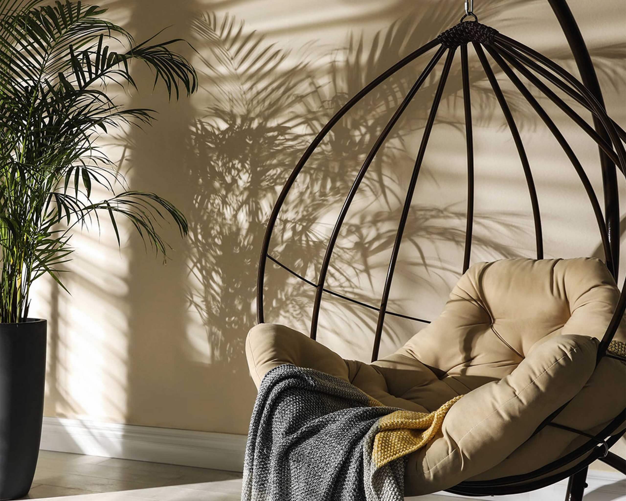 Photo courtesy of Laurentide Paint
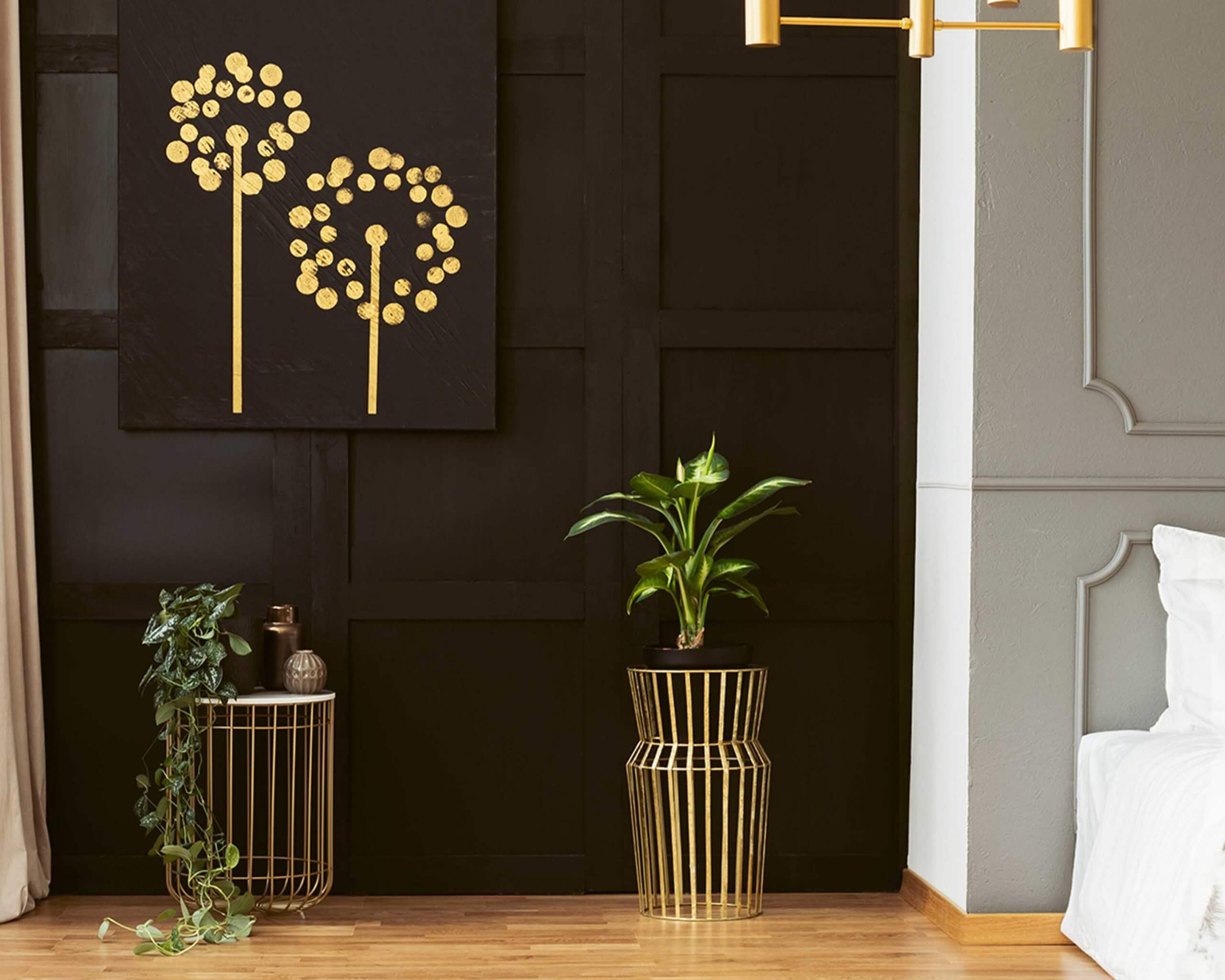 Photo courtesy of Laurentide Paint
He explained that Boomerang’s available colour line is influenced by consumer trends. Laurentide has a marketing team that monitors design and decor preferences to gauge what people like to buy. As a result, Boomerang colour palettes portray the latest trends, while emphasizing a commitment to recycling and sustainable development.
Desrosiers emphasized that even though Boomerang paint equals “new” paint in quality and performance, its retail price tag is about half the cost of competing lines. “The only compromise between recycled paint and virgin paint is the more limited choice of colour.”
Business has been booming at Laurentide during Covid-19. The factory implemented safety precautions promptly and was able to respond to increased demand. “Demand exceeded my expectations,” reported Desrosiers. “People stayed home, and they had the time to do these projects.”
As for its current line, Boomerang’s “Tonic” palette features rich, Earth-inspired hues such as Evergreen and Galaxy, as well as Truffle and Coal. Desrosiers reported that Millennium Pink is also trending with younger people, judging by their social media activity, and white is always in demand. —
